
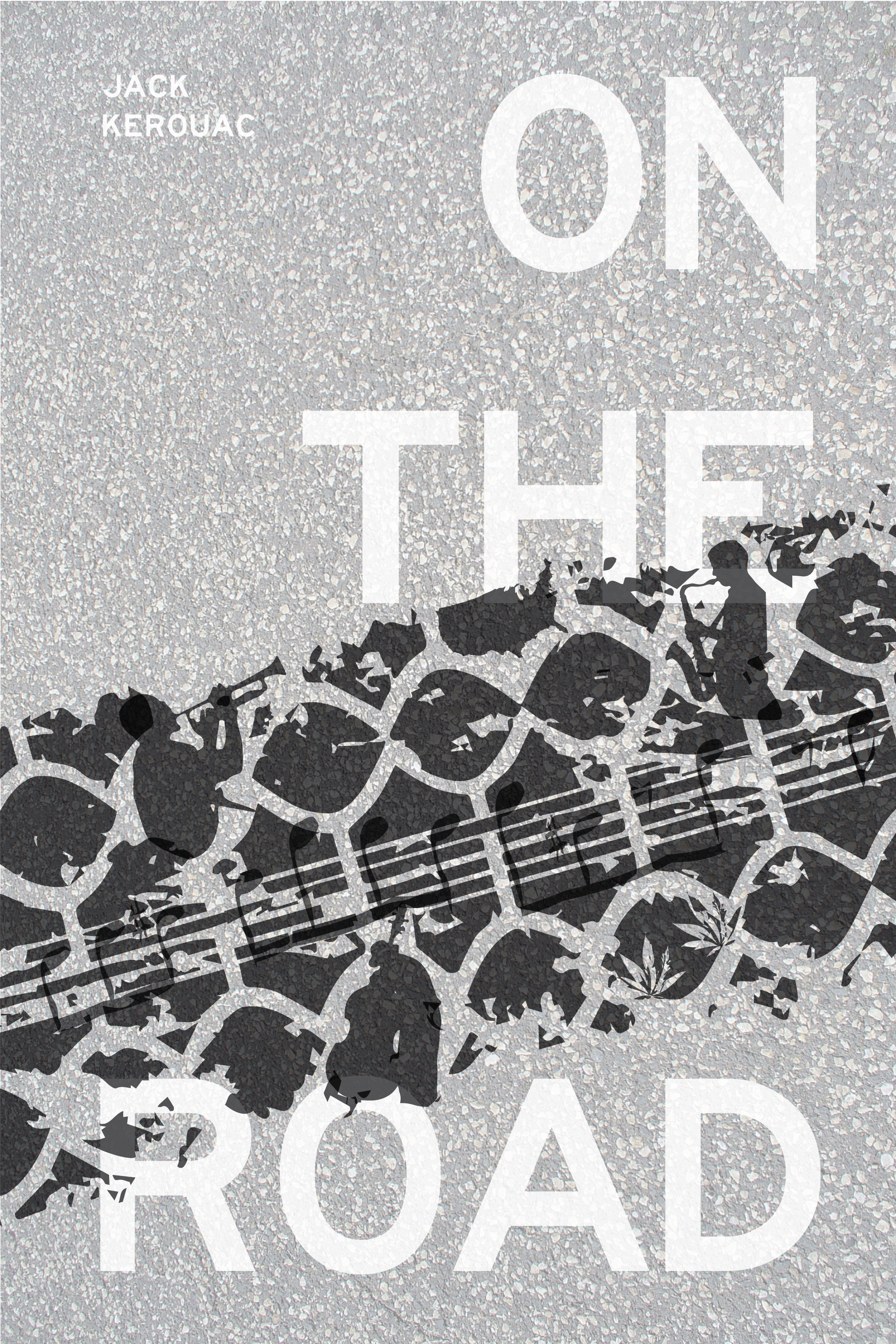

On the Road by Jack Kerouac (1957)

The bright colour pallet on the original cover might make the book pops up at the bookstore, but the cover design doesn’t tell enough about the story. Readers need to read the subtitle to get a little more information about the story which is still not enough to show the story briefly.
Iterations:


The Stranger by Albert Camus (1942)

The cover design perfectly communicates the notions of isolation, loneliness, indifference, being a target, and the incompatibility of an outsider. It is simple but powerful since it only uses minimal amount of visual element to deliver many symbols and metaphors from the novel itself.
“He does not divulge to the reader any spe- ci c reason for his crime or what he feels, other than being bothered by the heat and intensely bright sunlight. (wikipedia)”
Iterations:


1984 by George Orwell (1949)

The colour pallet of original cover conveys senses of pressing, heavy, dark, death, and violence. The image of eye shows the major setting/ quote of the storyline (“Big Brother is watching you”); yet, the off pupils make the image less powerful as this eye is not “watching” the viewer.
Iterations:


