This is Sharon Y. Yu’s latest logo for 2020. There are several details and design highlights in this version: colours, image, fonts. First, there are multiple design functions in the choice of colour – Greys.
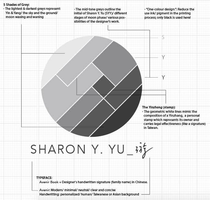
The different shades of grey colour bring visual depth to this circular logo to create a subtle image of the Moon phase/ waxing and waning. The gradient of different greys creates a visual flow to encourage the viewer to “read” the logo from the top-left corner (the lightest grey) to the bottom-right corner (the darkest grey) and “discover” the hidden letters of “SYY.” This B&W/ greys-only logo is also a eco-friendly design as it doesn’t need more than one colour of ink in the printing process.
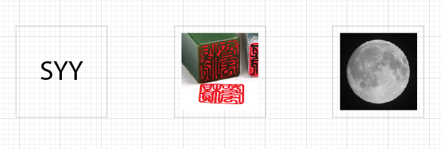
This image of this logomark is a combination of designer’s initial, a Yinzhang (personal stamp/ seal), and the Moon, which has been the most significant symbol and a metaphor of life to Yu herself. The round-shape logo filled with straight white lines mimic the detail of a Yinzhang. Yu, in addition, brings a whole world into her new logo — in ancient Taoism philosophy, the round shape symbolizes the sky, and the square/ rectangle shape symbolizes the ground/ the earth — to motivate and encourage herself to learn more from different perspectives, to create more for various purposes, and contribute more to the global society.
The font choice of this logotype is thoughtful. Yu uses Avenir (Book) to create certain visual tones: modern, minimal, neutral, clear and concise. Yet, Yu adds a handwritten signature of her family name in Chinese here to brings some warm human touch in this logotype – a bit of personal, a bit of cultural, a bit of “real.”
Design concept: Initial “SYY” + Yinzhang (stamp/ seal) + the Moon

Design anatomy:

Usage:


